The Problem
A tool built fast, with a design that shows it.
The Project Manager Tool was built rapidly with AI to solve a real operational need. It works, but the design is busy. The information architecture doesn't reflect how PMs actually think about their work.
The core challenge: The Project Manager Tool has two distinct audiences with different needs. Internal PMs need a command center. Clients receiving project timeline links need clarity and confidence, not a wall of data.
Internal PMs
- Bird's-eye view of all projects
- Task status at a glance
- Team availability and assignments
- Stage gates and deadlines
Client-facing links
- Project timeline clarity
- Progress without internal noise
- Clean, trustworthy presentation
- No login required
Before & After
Same information. Way less noise.
The original design surfaces everything at once — every task, every detail, every status. The redesign is about synthesizing what matters at the bird's-eye view and letting PMs drill down when they need to.
This is grounded in a basic behavioral principle: when people are overwhelmed by data, they disengage. Effective data visualization isn't just about aesthetics, it's about reducing cognitive load so the right decisions get made faster. A cleaner dashboard isn't just easier to look at, it's easier to act on.
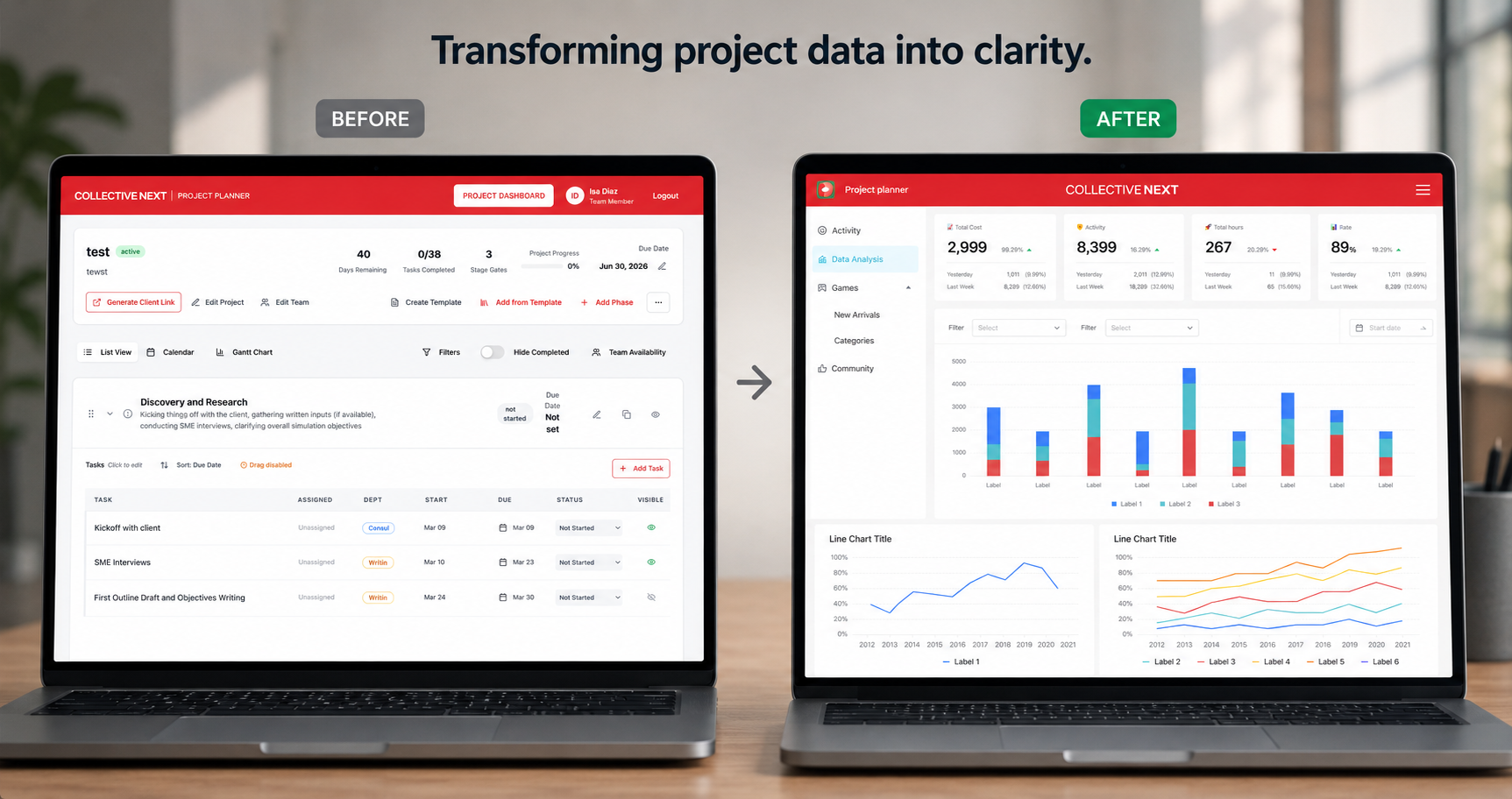
Before and after — project manager tool redesign
Key Insight
What I learned about designing with AI.
This project introduced MCP (Model Context Protocol) servers as part of the build criteria, meaning the design had to be structured specifically so AI could execute it accurately in Figma. That constraint changed everything about how I approached the spec.
The learning: AI needs to be briefed like a junior designer, not a search engine. The quality of a Figma implementation via AI is entirely dependent on how well you've specified the design intent upfront, down to component logic, naming conventions, and spacing rules.
Understanding what MCP servers need to execute a design changed how I think about design handoff entirely — not just for AI, but for human engineers too.
The unlock
"The better you understand what AI needs to execute your design, the better your design specs become for AI and humans alike."
Current Status
Dashboard done. Aggregate view next.
This is a living project — I'm actively designing and implementing it alongside my day-to-day work. Here's where things stand: